
MountainMovers
"From scattered to summit-ready."
The Challenge
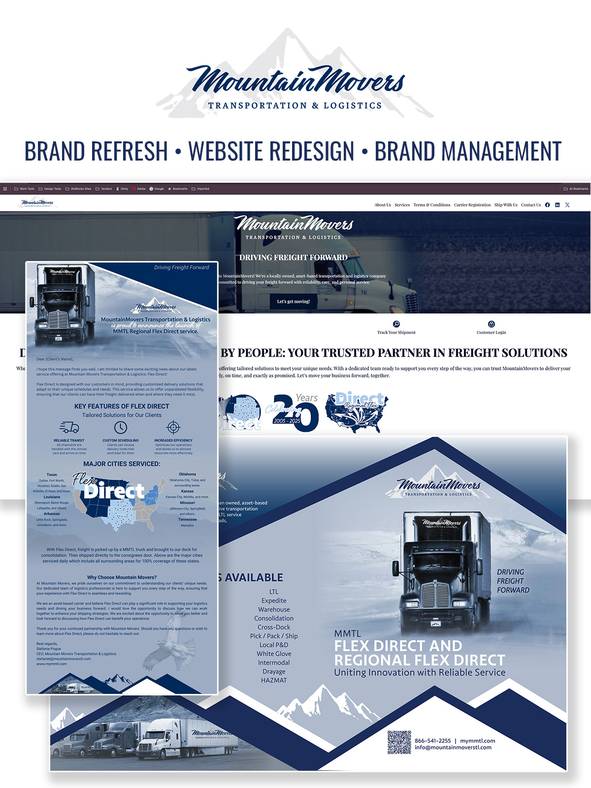
MountainMovers was hauling freight across the country with a brand that looked like it got left at a truck stop. Mismatched logos on their trucks, invoices, and socials meant they blended into an endless line of plain white semis. Dispatch, sales, and marketing were each telling a different story, and shippers couldn't tell what actually set them apart.
What We Did
A full brand audit and identity system: a bold navy-and-steel palette, a confident hand-lettered wordmark, fleet-ready logo lockups, and a messaging framework the whole team could run with. We built templates for trucks, proposals, and social so every single touchpoint finally looked like the same company.
The Result
MountainMovers now shows up like the reliable, cross-country heavyweight they are. Their fleet doubles as a rolling billboard, sales pitches land with one consistent story, and the team has a brand they're genuinely proud to put on the door.